
Image is Everything: Ways to Stay On-Brand On Social Media
As marketers or business owners, we all know how important it is to build up a strong brand that follows you from platform to platform. Creating a consistent brand image is crucial to creating brand awareness and loyal customers. Here are some tips on how to stay on-brand in your social media marketing.
Branding is a crucial aspect of creating a successful business. You must create a strong brand with powerful imagery if you want to create brand awareness. Everything from the colors you use, to the font faces featured on content, can send a message to consumers. With effective brand elements and consistency, your business can stay on brand even when the company name is not explicitly mentioned. Think about a powerhouse company like Coca Cola. All it takes to recognize that a post or product belongs to Coke is the shape of the bottle, the colors red and white, and the iconic script. At the end of the day, that should be your ultimate goal: creating a brand that is easily identifiable, if only through the elements.
Colors
The colors you choose for your brand should be selected for a reason. Different colors evoke different emotions, and you want to be sure that the message your brand colors give off matches the message of the brand itself. Let’s take a look at the psychology of colors so that you can avoid inappropriate selections when building your brand.
Yellow: Yellow is the happiest color. It often portrays feelings of optimism and warmth.
Orange : Orange represents creativity, adventure, and enthusiasm. When creating a brand be careful to not overuse orange as it can be alarming and is typically one of the least favorite colors for both men and women.
Red: Red is associated with danger, excitement, energy, and action. Overusing red in social branding is not a good idea. Use red sparingly for call to actions or limited time offers only.
Blue : Blue is related to calm, peace, and trust. Many fields use blue when building brands including technology companies, healthcare facilities, and banks.
Green : Green is associated with nature, money, health, and growth. Health and fitness businesses could benefit from incorporating green, as could marketers, financial advisers, or health food companies.
To read more about the psychology of color, check this out: https://bsyl.ink/ColorPsychology.
.
Fonts
Staying on brand is about more than just color and creating a brand is harder than it seems. When posting on social media, you should also use consistent fonts because they can convey messages about your business. Sans Serif fonts do not have “tails” and are great for a cleaner, more modern brands. Serif fonts (like Times New Roman) are more elegant and classic. Make sure you don’t use an “old-looking” font for a young and fresh company or vice versa. To state the obvious, always make sure your font is easy to read or your customers will struggle to understand your messages. You can and should utilize more than one font, but make sure they complement each other well and are all used regularly.
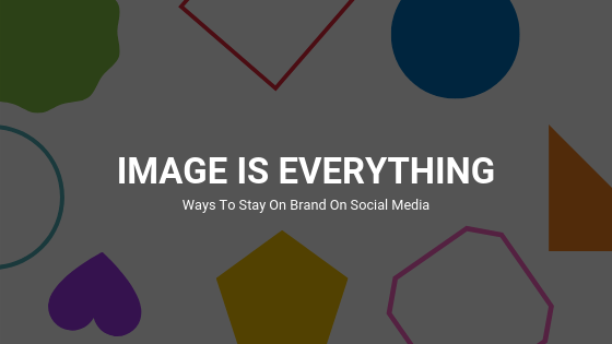
Shapes
People don’t always think of shapes when it comes to building a brand identity. Let’s go back to the Coca Cola example. The iconic Coke bottle represents the brand without needing any particular color or copy. Coke uses the signature bottle shape enough that, by itself, it can send a message about the brand. Shapes can also include smaller logos that are not accompanied by words like car symbols. You would be hard-pressed to find someone with so little brand awareness that they could not tell you what car is a Toyota and which is a Honda. Finally, shapes can include the shapes used in creative content. Are you a straight-shooting company that uses harsh lines and sharp corners, or does your content tend to showcase circles, dots, and soft curves? All of these interpretations of shapes come into play when you start social branding. If you want to learn about the psychology of shapes, take a look at this article: https://bsyl.ink/PsychologyOfShapes..
Content
The actual content you post on social media can create a brand image. Are you a brand that posts quotes? Memes? Full images? Designs with images? The choice is yours but once you build a brand, it can be hard to change, so really think through your strategy. Social branding in terms of content is, fortunately, easier to change than the logo and all brand elements. However, if you get followers because they like the aesthetic of your posts and they suddenly change, you may find yourself with lower page likes and engagement. Always keep the tone of your business in mind when you create content. Classy, high-tech companies should not be putting out the same type of posts as a family-owned restaurant. Each business has a unique voice, and the content must reflect that.
How to Stay On Brand Online
Now that you have a basic understanding of colors, fonts, and shapes you can probably guess that using the correct ones is important. Social branding is about more than choosing the correct elements in the beginning. If you hope to build brand awareness, you must use the same elements consistently from post to post and from platform to platform. Of course, you can branch out of these elements every so often to change up your content, but if you constantly change your elements, your brand awareness will never be strong enough for your content to be easily recognized.
If you want to stay on brand when it comes to social media, you need to make sure that everyone posting understands the brand elements and typical branding you do. Everyone on the team needs to be on the same page so that all of your company’s posts look and feel the same. You wouldn’t be friends with someone who never looks or acts the same, so why would you trust a business that does? If you need more tips on creating the right social look, take a look at our blog: https://bsyl.ink/SocialLook.
If you are struggling with social branding or building a brand altogether, contact us at BusySeed. We are experts in social media and have successfully created brand voices for clients on all social media platforms. We want to help you and your business succeed. We will get you the brand awareness you deserve, keep you on brand, and launch your company to new heights. Call today to get started: (888) 353-1484.

About the Author
Omar Jenblat is a powerhouse in the digital marketing landscape, renowned as the Founder and CEO of BusySeed, an award-winning agency that has scaled over $1B revenue for 550+ businesses through high-performance growth strategies. With a technical foundation in computer engineering, Jenblat bridges the gap between complex data analytics and creative marketing, specializing in aggressive revenue scaling, SEO, and multi-channel lead generation. As a member of the Forbes Agency Council, The Org, and a visionary entrepreneur behind ventures like LeadChaser.ai, The Honest Agency, and Zeed Agency, he has established a global footprint by leveraging a "human-led, AI-assisted" philosophy to drive measurable ROI for major brands and startups alike. His expertise is characterized by a focus on digital automation and performance-driven results, consistently positioning his firms at the forefront of the evolving technological landscape.