

Brand Guidelines
The single source of truth for how BusySeed looks, sounds, and shows up, from the leaf mark to the last pixel of the last app we ship. Humans at the helm. AI in the engine.
Partners in revenue growth.
A collective of Growth Architects that has helped 500+ businesses drive revenue through marketing, sales and technology. People own the strategy and the relationship. AI accelerates the work. The balance is the brand.
Generated
In client revenue
Businesses
Served
Reputation
Five-star reviews
Ranking
US agency, TrustAnalytica
Positioning statement
For growth-minded businesses, BusySeed is the growth partner that blends marketing, sales, and technology, with real humans accountable for real revenue.
Confident, human, proven.
Confident · Results-driven · Human · Grounded · Forward-looking · Proven
Growth is the metric
Every engagement is measured in revenue moved for the client, not vanity metrics. We lead with proof.
Humans, amplified by AI
People own the strategy and the relationship. AI accelerates the work. The balance is the brand.
Rooted and growing
The seed and leaf signal patient, compounding growth that stays steady, natural, built to last.
Credible by default
Certifications, rankings, and named results carry the story. We show receipts, not adjectives.
Give it room. Keep it intact.
"Busy" in SeedGreen, "Seed" in SeedBlack, anchored by the growth-bar leaf. The leaf stands alone as an icon and a brand device. There is one leaf file and it is assets/leaf-green.png. Nothing else is the leaf.
Primary · on lightAll-white · on pineLeaf mark · 24px minAll-white leaf · on pineClear space
One leaf height on every side. Nothing enters it, including page edges, photo edges and neighbouring type.
Minimum size
120px wide for the full lockup, 24px for the leaf alone. Below these the growth bars inside the leaf close up and the mark reads as a blob.
On photography
Always the all-white lockup, and only on a genuinely dark area. On a busy or mid-tone image, drop a pine overlay behind it first.
Never do this
The wordmark has one aspect ratio. Scale both axes together, always.
Green equity is the point. There is no orange, teal or navy lockup.
Never the color lockup on green. Mid-tone grounds get the all-white lockup.
- ▸Never redraw the leaf, in any tool, for any reason, including AI. The leaf carries embedded growth bars that no model reproduces correctly. If it was not loaded from leaf-green.png, it is not our leaf.
- ▸The growth bars are white, not black. Any leaf with dark bars is a bad approximation and must be replaced, including the copy currently sitting in the admin repo at public/logos/.
- ▸No rotation, no shadow, no outline, no gradient fill on the lockup or the leaf. It sits flat.
- ▸No lockup edits. Do not re-space "Busy" and "Seed", swap the leaf position, or set the name in another typeface as a substitute.
- ▸The 10-year badge is retired. It marked the anniversary only and must not appear on any new work. Remove it wherever it survives.
- ▸Never inside a container that fights it. No circle crops, no colored tiles, no "app icon" treatment except the shipped app-icon.png.
Grounded greens, one warm spark.
Primary
Secondary
Neutrals are warm. There is no blue-gray in this brand.
Text and ground pairs that are approved
Pairs that are banned
SeedMint is a tint, not a ground for light type. It carries SeedPine text and nothing else. This also rules out white-plated photo cutouts on a mint field.
If a mint panel needs light type, it is the wrong panel. Switch the ground to SeedPine instead of switching the text.
Where each color earns its place
- ▸Light surfaces. Paper, Mint Soft or White on 75 to 80% of any layout.
- ▸Dark sections. SeedPine is the only dark ground, never SeedBlack. One dark region per screen.
- ▸Orange is precious. Primary marketing actions and key numbers only. Never a background field, never behind a headline, never more than one per view, and never a button inside a product.
- ▸SeedGreen is an accent, not body text. It is for eyebrows, icons, rules, check-marks and marketing links. Body copy is Gray 700 or SeedBlack.
- ▸Status is four families. Good, warn, critical, neutral. Anything new maps onto one of them rather than introducing a fifth color.
- ▸Charts draw the ramp in order, viz-1 through viz-7. Orange is viz-4 and reads as "the answer", so it appears once at most.
- ▸No new hex codes. If the thing you need is not in the ramp, it is a token request, not a one-off value in a stylesheet.
Status families
Good
Efficient, on pace, healthy
Warn
Slipping, needs a look
Critical
Losing money or blocked
Neutral
No data yet
Georgia titles, Lato text.
Georgia has two weights doing two jobs: 700 is the marketing voice, 400 is the product title voice. Both are Georgia, so the website and the products are visibly the same company without the app shouting. Georgia stops at 24px. Below that its serifs thin out and fringe, so everything smaller is Lato.
Georgia
Titles and display. 400 / 700 / italic.
Lato
Body and UI. 400 / 700 / 900.
JetBrains Mono
IDs, timestamps, code, endpoints.
Marketing scale
Georgia 700 · 72
Georgia 700 · 42
Georgia 700 · 27
Lato 400 · 17 / 1.65
Product scale
Georgia 400 · 32
Georgia 400 · 26
Lato 700 · 18
Lato 400 · 13 / 1.6
Lato 400 · 11
Eyebrows and numbers
Eyebrows
Credentials
Marketing · 13px · .14em · SeedGreen · 22px rule
Overview
Product · 10px · 2px · SeedOrange · no rule
Numbers
Label above, in micro-caps. Always tabular-nums.
Type rules
- ▸Three families, no fourth. Georgia, Lato, JetBrains Mono. No icon fonts, no display cut for a single campaign.
- ▸Georgia has a 24px floor. At 24px and above it is our voice. Below 24px the serifs fringe and the whole surface looks cheap, so product section titles, card titles, table figures and stat values under 24px are all Lato 700.
- ▸Never Georgia for body copy and never Lato for a headline above 24px. The split is what makes the system readable at a glance.
- ▸Never below 13px in product, 15px in marketing, 12pt in print. 11px exists only for timestamps and micro-labels.
- ▸Two weights per screen. Regular and bold. No light weights, no faux-bold, no letter-spacing on lowercase text.
- ▸Uppercase is for eyebrows, status pills and micro-labels of two or three words at most. Never a headline, never a button, never a sentence, and never a full line of information. Letterspaced mono caps are not a style we use for reading: addresses, version lines, table headers, captions and colophons are sentence case Lato.
- ▸Body copy caps at 720px (--maxw-prose). Long measure is the fastest way to make a page feel unedited.
Confident, human, receipts-first.
We speak like a partner who has done this 500 times. Direct, proof-led, warm. Lead with the result; name the number.
Do
- Lead with the outcome and the number."Generated $540M+ in client revenue."
- Sound like a human partner, not a platform."Your partners in revenue growth."
- Back claims with proof: rankings, certs, names."Ranked #1 Growth Group by TrustAnalytica."
- Keep sentences active and confident."We help you grow", not "Growth can be achieved".
Don't
- Hype without proof."Revolutionary game-changing synergy."
- Bury the result in features and jargon.Leading with tools instead of outcomes.
- Sound robotic, or shout in ALL CAPS.Let the numbers carry the emphasis.
- Abbreviate the name.Not BS. Not Busy Seed. Always BusySeed.
Hard rules
- ▸No em dashes, en dashes or double dashes anywhere. Use a comma, or start a new sentence. This is linted in the admin dashboard and rejected before save.
- ▸Person. "You" for the reader, "we" for BusySeed. Third person only in boilerplate and meta descriptions.
- ▸Casing. Sentence case everywhere except eyebrows and micro-labels. Headlines take a full stop. Buttons are sentence case.
- ▸No emoji. Not in product, not in marketing, not in decks. Status is a Pill; emphasis is weight.
- ▸Numbers first. Every claim carries a figure. Every proposal line carries a quantity.
- ▸The Seed naming system is one word, camel-cased. SeedGEO, SeedLeads, SeedOutreach, SeedEnrich, SeedSite. Never Seed GEO, never seedgeo.
UI copy
| Element | Rule | Example |
|---|---|---|
| Buttons | A verb and its object. Sentence case. No "click here", no "submit". | Onboard a new client |
| Empty states | Say what goes here, then offer the action that fills it. | No campaigns yet. Create your first sequence. |
| Errors | Name what failed and the next step. Never blame the user, never expose a stack trace. | We could not reach HubSpot. Reconnect the integration to retry. |
| Confirmations | Name the object and the consequence in the button, not just "OK". | Delete 3 sequences |
| Loading | Nothing. A skeleton does the talking. No "Please wait". | no copy at all |
| Toasts | Past tense, one clause, and the object named. | Client saved. |
One language, two densities.
Marketing persuades. Products report. They share every token and diverge on exactly four things. Nothing else is allowed to drift.
Type weight
Georgia 700 on marketing, Georgia 400 in product. Body 17px vs 13px.
Primary action
Orange pill on marketing. Pine in product, SeedGreen for the rail's one action. Orange never becomes a product button.
Card treatment
1px line, 20px radius, soft shadow on marketing. A real 0.5px hairline, 8px radius, no shadow in product.
Motion
Reveals, count-ups and marquees on marketing. In product, hover and panels only. Numbers never animate.
The half-pixel hairline is not a rounding error. It is what makes the admin read as something printed rather than something boxed, and rounding it to 1px changes the character of the whole product.
Which chrome belongs to which app
| Surface | Chrome | Why |
|---|---|---|
| Marketing site | 76px white header, orange CTA on the right, no sidebar | One conversion path, nothing competing with it |
| Admin dashboard | 62px pine icon rail plus 242px pine section rail, paper work area | Operators move between five product areas fast; the views and the primary action stay one click away in the rail |
| SeedOutreach | 224px SeedPine sidebar, no top bar | Deep, sectioned workflows. The pine rail tells you which app you are in |
| Proposals and decks | No chrome. Full-bleed sheet or slide | They are documents, not interfaces |
Four-pixel ladder, generous rhythm.
Every gap, pad and margin in every surface comes off one ladder. A value that is not on the ladder is a bug.
Frame measurements
| Token | Value | Applies to |
|---|---|---|
| --maxw-marketing | 1200px | Every marketing section's inner width |
| --maxw-app | 1320px | Admin and SeedOutreach content column |
| --maxw-prose | 720px | Any paragraph, anywhere |
| --gutter / --gutter-app | 32px / 40px | Page edge padding |
| --section-y | 96px | Marketing vertical rhythm, 64px when tight |
| --h-topnav / --h-header-marketing | 56px / 76px | Fixed chrome heights, never adjusted per page |
| --h-control / --h-control-lg | 32px / 44px | Product controls / marketing and touch controls |
| --w-sidenav / --w-slideover | 224px / 480px | SeedOutreach rail, detail panels |
Do
- Space with flex or grid and a gap.Gaps survive reordering. Per-element margins do not.
- Let a section breathe at 96px top and bottom.Whitespace is how a premium page signals confidence.
- Keep one clear focal point per screen.The eye needs somewhere to land first.
- Align everything to a 12-column grid.Marketing pages are built from columns, not from guesses.
Don't
- Invent a 15px or 27px gap.If it is not on the ladder, round to the nearest step.
- Fill an empty area with a section nobody asked for.An empty-feeling page is a layout problem, not a content gap.
- Nest a scrolling region inside a page.One scrollbar per view, and it belongs to the page.
- Center long body copy.Left-aligned, capped at 720px, always.
The building blocks.
Buttons
| Level | Marketing | Product | Per view |
|---|---|---|---|
| Primary | Orange pill, near-black label, CTA shadow | Pine rectangle, 6px radius, white label, no shadow | Exactly one |
| Secondary | 2px SeedGreen outline, pine label | White fill, 1px line, pine label | One or two |
| Tertiary | Pine text link with arrow | Gray 700 text, underline on hover | As needed |
| Destructive | Not used | Critical text on white, critical fill only inside a confirm dialog | One, and always confirmed |
Status pills
Square 4px pills carry status. Rounded mint pills carry categories and are never colored by status. A pill is never clickable, and never the only thing communicating a state.
Corner radius
Cards, side by side
Qualified pipeline, not raw clicks.
Icons
One line-style set, 1.5px stroke, SeedGreen or Gray 500, 20px in product and 24px in marketing. Unicode glyphs carry in-product affordances today: + new, ⏱ log time, ✨ Ask AI, → ↑ ↓ direction and sort, › breadcrumb, × close, ⚠ warning. Third-party logos come from simpleicons.org and keep their own brand color. The leaf is never an icon in an icon row.
Elevation
| Step | Token | Where |
|---|---|---|
| Flat | --border-hair | Every product card and table. No shadow at all |
| Card | --shadow-card | Marketing cards at rest |
| Lift | --shadow-lift | Hover, dropdowns, toasts |
| Pop | --shadow-pop | Modals only |
| Panel | --shadow-panel | Slide-overs only |
Four steps, no fifth. Shadow signals distance from the page, so two components at the same distance take the same shadow.
Dense, calm, printed, never bubbly.
Everything we build (the admin, SeedOutreach, and whatever ships next) is one product family. An operator should be able to move between them without relearning anything. These are the rules that make that true.
Page anatomy
Every screen in every app is assembled in this order. No screen invents its own arrangement.
1. Chrome
Admin (SeedDash): 62px pine icon rail of product areas plus a 242px pine section rail of views with the section's primary action. SeedOutreach: 224px pine sidebar. Fixed, present on every screen, never restyled per page.
2. Header block
Breadcrumb, Georgia 400 title, one-line description, and the page's primary action on the right. Filters sit under it, never above the title.
3. Content
Stat tiles first if the page has them, then the table or the panels. Paper ground at #FBFCFA, hairlined white cards on top, Canvas #F0EEE9 for wells and insets.
4. Detail
Drilling in opens a 480px slide-over, not a new page, unless the record has its own URL worth sharing.
The rules that get broken most
- ▸The ground is paper, the cards are hairlined. #FBFCFA behind, white cards held by hairlines on top, Canvas #F0EEE9 for wells and insets. Never a gray-blue canvas.
- ▸Hairlines, not borders. 0.5px at 8% black. Do not round it to 1px, do not swap it for a shadow, do not stack a hairline and a shadow on the same card.
- ▸Orange is never a product button. It appears as a product eyebrow, a single flagged number, or the viz-4 series. Primary actions are SeedPine.
- ▸Numbers never animate in product. A count-up on an operational figure makes people distrust it. Count-ups are a marketing device only.
- ▸One dark region per screen. The pine rail is that region: SeedDash's icon rail and section rail read as one. Do not add a pine card next to it.
- ▸Titles are Georgia 400. Product headings never take the marketing 700 weight. The app states, it does not sell.
- ▸Nothing moves under the cursor in a dense view. Table rows take a white wash, not a lift. Cards lift 1px at most.
- ▸One scrollbar. The page scrolls. Panels inside it do not, unless they are a slide-over or a listbox.
- ▸AI output is always labeled and always attributed. An ✨ marker, the model's confidence in words, and a visible way to dismiss or correct it. AI never writes to a record without a human confirming.
- ▸Destructive actions are confirmed, and the confirm names the object. "Delete 3 sequences", never "Are you sure?". Undo where the data allows it.
- ▸Timestamps are mono and absolute. 8/10/2026, 11:00:08 AM. Relative time ("2h ago") only as a secondary label beside it.
- ▸Every screen has a loading, empty and error state designed. A screen shipped with only its happy path is not finished.
Density
| Measure | Admin and SeedOutreach | Marketing |
|---|---|---|
| Body text | 13px / 1.6 | 17px / 1.65 |
| Control height | 32px | 44px |
| Card padding | 20px 22px | 30px |
| Table cell padding | 14px | Not applicable |
| Gap between cards | 16px | 22px |
| Card radius | 8px | 20px |
Do, in product
- Put the primary action in the header block, right-aligned.Operators learn one place to look.
- Show the number and its label, in that order, with the label in micro-caps above.Consistent tiles scan in a single pass.
- Make every row clickable into detail, with the whole row as the target.A tiny chevron is not a hit area.
- Preserve filter and sort state in the URL.Operators share views with each other.
- Keep the last-synced time visible wherever data comes from an integration.Trust in a dashboard is mostly freshness.
- Group actions that belong together into one toolbar.Not scattered across the page.
Don't, in product
- Use a marketing card in an app screen.20px radius and a soft shadow instantly look like a different product.
- Introduce a fifth status color.Map onto good, warn, critical, neutral.
- Put a spinner where a skeleton belongs.Skeletons keep the layout stable, spinners hide it.
- Open a modal for anything a slide-over can hold.Modals block work. Reserve them for confirms.
- Hide a destructive action inside a row hover menu only.Discoverable, and confirmed.
- Add an emoji, a bounce, or a celebration animation.The app is a tool, not a game.
Every new app invents a new header.
The reason the tools look unrelated is not color. It is that each one invented its own chrome, its own page title, its own idea of density. Same green, five different products.
What went wrong
- A tool picks a rail, the next picks a top bar, a third picks a hero band, with no rule for whichNothing signals whether you are inside a console or a landing page.
- Marketing chrome on internal screensA dark hero band on a five-row utility wastes the fold and reads as an ad.
- Client-facing tools built with operator densityA prospect gets an 11px label and a gray table. It looks unfinished, not efficient.
- Uppercase column heads, three table designs, four card radiiThe same data looks different in every product.
The rule now
- Audience picks the tier. Tier picks the chromeOperator, internal tool, client. There is no fourth answer.
- Chrome is inherited, never designedCopy the shell from this page. The only thing you author is the work area.
- One table, one form, one card, one curveEverything below the chrome already exists in the guide.
- Orange means client. Pine means usThe fastest read of which side of the wall a screen lives on.
Operator, tool, client.
Read down the column that matches your audience. Everything in that column is decided for you before you open the file.
| Tier A · Operator console | Tier B · Internal tool | Tier C · Client-facing | |
|---|---|---|---|
| Who is looking | Our team, all day, many jobs | Our team, one job, in bursts | Clients and prospects, once or weekly |
| Chrome | Pine icon rail 62px plus pine section rail 242px, views with counts | Pine left rail, 216px, grouped destinations with counts | White nav, 70px, marketing logo, orange CTA |
| Ground | Paper #FBFCFA, canvas insets | Canvas #F0EEE9 | Paper #FBFCFA |
| Density | Dense. 12px rows, 13px body | Dense. 12px rows, 13px body | Generous. 20px rows, 15-17px body |
| Radius | 6-8px | 6-8px | 12-20px, pill CTAs |
| Primary action | SeedGreen block at the top of the section rail; pine in the work area | Pine, 32px, square-ish | Orange pill, 48px, one per view |
| Page title | Georgia 400 at 30px | Georgia 400 at 28px | Georgia 700 at 40-48px |
| Data | Hairline ledger, always | Hairline ledger, always | Ledger inside a card, fewer columns, plain-language headers |
| Motion budget | 120-220ms, state feedback only | 120-220ms plus run progress | Up to 400ms, one reveal per section |
| Never | Hero bands, orange fills, illustration | Hero bands, dashboards it does not own | Raw IDs, 11px labels, debug states |
The console you live in.
One product, many jobs, all day. A 62px icon rail carries the product areas because they are peers you switch between all day; a pine section rail beside it carries the views inside the area you are in, with counts, and the area's one primary action at the top. Ask AI is part of the chrome, at the foot of the icon rail.
Sales
Open pipeline, what is at risk, and the deals the model thinks close this week. 18 open deals across 4 owners.
What to copy: the paired pine rails: a 62px icon rail naming the product areas with the one you are in lifted, and a 242px section rail listing that area's views with mono counts on the right and its single primary action as a SeedGreen block at the top; the work area on paper with an orange eyebrow, a Georgia 400 title and one line of plain English; the KPI strip as one hairline-divided block, never five floating cards; the ledger with sentence-case headers and right-aligned tabular figures. Ask AI is chrome, labeled, at the foot of the icon rail, never a floating bubble. Beyond the eyebrow, the only orange on the screen is the one number that needs a person to act.
Few destinations, deep lists.
An internal tool owns one domain and has three to eight destinations. A rail suits it: the destinations stay visible while you scroll a thousand rows, and counts live next to them. This is the shape SeedAuthority already had right.
SeedAuthorityInternal tool · not client-visible
Northwind Health
Active, $7,499 per month, owned by A. Reyes. Highest-authority inventory for health and wellness.
What to copy: the rail groups destinations under 9.5px micro-labels and puts counts on the right, so the rail doubles as a status board; identity sits at the foot with the words internal tool so nobody mistakes it for something a client sees; the work area starts with a back link, an eyebrow, a Georgia title and one line of plain English explaining the sort. Selected chips are solid pine, not outlined mint.
One input, one queue.
Most internal tools are a form and a list of runs. They do not get a hero band, a marketing headline, or a full-bleed pine header. They get the same rail, a compact run form, and the ledger showing what has been run. This is SeedAds rebuilt.
SeedAdsInternal tool · not client-visible
Runs
Give SeedAds a business and a domain. It finds that business's live Meta ads, scores them, and rebuilds the strongest three.
Leave the page id blank to let the resolver find it. It only proceeds on a confirmed match.
What changed from the old SeedAds: the full-bleed pine hero became a 216px rail, which gives the tool navigation it did not have; uppercase column heads became sentence case; the form became a four-column card that fits above the fold with the queue; and the run list now carries the numbers that matter (ads found, best score, live progress) instead of five identical rows that all say done. Same tokens, a tenth of the wasted space.
It should feel like the website, logged in.
The moment a client sees a screen, the shell changes: white nav, the marketing logo, an orange pill for the one thing we want them to do, Georgia at full weight, and air. The data underneath is still the ledger, with fewer columns and headers written in their language.
Northwind HealthBook a strategy callAugust is tracking 22% ahead of July.
Here is where your revenue is coming from this month, what we shipped, and what we are working on next. Updated every morning at 6am.
Where the leads came from
Every channel we run for you, this reporting period.
| Channel | Leads | Cost per lead | Change |
|---|---|---|---|
| Google Ads | 412 | $38 | +18% |
| Organic search | 386 | $0 | +9% |
| Meta | 240 | $51 | −6% |
| 168 | $4 | +31% |
What we shipped
The last five things that went live.
What to copy: the marketing logo, not the leaf alone; one orange pill in the whole view; headline written as a finding, not a label: “August is tracking 22% ahead of July” beats “Dashboard”; numbers in Georgia 700 because a client reads four of them, not four hundred; column headers a client would say out loud (“Cost per lead”, never “CPL”). Nothing on this screen exposes an internal id, a run status, or a queue.
A free tool is a landing page that does something.
Unauthenticated tools sit inside the real site chrome and behave like the rest of the marketing site: full-width nav, one question per step, a single orange action, and proof underneath. The tool is the argument for the retainer, so it has to look like the site that sells it.
Increase my revenue →What do you want AI to recommend you for?
Type the exact question your buyers ask ChatGPT, Claude or Gemini. We check the top answers and tell you whether you are in them.
Free, no account, results in about 40 seconds.
What to copy: the tool lives inside the site nav, so it never looks like a stray subdomain; the step indicator is honest about how long this takes; one question in Georgia 700, one big input, one orange action; supporting fields are secondary and sit below the primary question, not beside it. Proof sits under the fold in the same three-stat rhythm the site uses. No card-in-a-card, no drop shadow stack, no second competing button.
Four questions, one answer.
| Ask | If yes | If no |
|---|---|---|
| Can a client see it? | Tier C. White nav, orange CTA, generous | Keep going |
| Does it cover more than one job? | Tier A. Top bar with peer sections | Keep going |
| Does it have 3 to 8 destinations? | Tier B with a rail | Keep going |
| Is it one form and one list? | Tier B, single-task layout. Rail still applies | It is a page in an existing product. Do not build a new panel |
What never changes across the three
- ●The table. Hairline ledger everywhere. Sentence-case headers, tabular figures right-aligned, 0.5px rules, no striping, no vertical rules.
- ●The type rule. Georgia only at 24px and up. Everything smaller is Lato 700.
- ●The status families. Four pills, four colors, same words in every product.
- ●The four-pixel ladder. Padding and gaps come off the same scale in every tier.
- ●The curve. One easing, one motion budget, one reduced-motion behavior.
- ●Orange is precious. Client CTAs and one key number. Never a fill, never a chart series that is not the highlighted one.
Labeled, quiet, forgiving.
Every field in every app is built the same way: micro-caps label above, 32px control, 0.5px hairline, mint focus ring. Nothing about a form should require a second look.
As it should appear on invoices.
Pick an owner before saving.
Placeholder used as the label, so it disappears on focus. Marketing radius on a product control. Label beside the field, which breaks the scan line. No help text, no error slot.
Field rules
| Concern | Rule |
|---|---|
| Label | Always visible, above the control, 10px micro-caps Gray 500. A placeholder is never a label. |
| Placeholder | An example of the format, or nothing. Gray 500. Never an instruction. |
| Help text | One line, 11px, below the field, present from the start rather than appearing on error. |
| Focus | SeedGreen border plus a 3px SeedMint ring. Visible for keyboard and mouse alike. Never removed. |
| Validation | On blur and on submit, never on every keystroke. The message replaces the help text in the same slot so nothing reflows. |
| Error text | Critical, bold, 11px, and it says what to do next. |
| Required | Mark the optional fields instead. If almost everything is required, marking required is noise. |
| Disabled | Gray 200 fill, Gray 500 text, and a reason nearby. A dead control with no explanation is a bug report waiting to happen. |
| Switch vs checkbox | Switch applies immediately. Checkbox waits for save. Never mix the two in one panel. |
| Select vs radio | Two or three options: radio. Four or more: select. Twelve or more: search field. |
| Buttons | Primary on the right, cancel as a text button to its left. Same order in every dialog and every form. |
| Save | Explicit save in the admin. Autosave only where SeedOutreach already autosaves, and then say so with a timestamp. |
Marketing lead forms are the one exception on size: 44px controls, 14px radius, generous spacing, and the orange CTA. They are conversion surfaces, not operator tools.
The table is the product.
Most of what we build is a table with opinions. It gets the most rules because it carries the most weight.
The hairline ledger
There is one dense-table treatment in this system and this is it. A white sheet on the warm canvas, half-pixel hairlines, sentence-case headers, figures right-aligned in Lato 700. Every account list, campaign list, contact list and time log in every product is this table with different columns.
| Client | Owner | MRR ↓ | Hours | $ / hr | Status |
|---|---|---|---|---|---|
| Northwind Health | Diana C. | $7,499 | 247.6 | $169 | Efficient |
| Cedar & Co | Nicole C. | $4,000 | 61.0 | $98 | At risk |
| Brightmeadow Care | Diana C. | $4,499 | 25.9 | 0 | No data |
Table rules
- ▸Headers are sentence case. Lato 700 at 12.5px in Gray 700 on a Paper band, with a 0.5px rule beneath. Not uppercase, not letterspaced: position and the rule already say "this is a header". Rows divide on the fainter 6% hairline.
- ▸Numbers right-align, in Lato 700 with tabular figures. Nothing in a table reaches 24px, so Georgia never appears in one. Text left-aligns. Nothing centers.
- ▸Hover is a white wash across the whole row. No lift, no per-cell ring, no color change, no scale.
- ▸Seven columns is the ceiling. Past that, move detail into the slide-over.
- ▸No zebra striping and no vertical rules. The hairline does the work. Stripes make a warm canvas look striped, not structured.
- ▸Empty cells read "0" or a neutral pill, never a dash and never blank. A dash in a figure column is the same mistake as a dash in a sentence, and a blank cell is indistinguishable from a bug.
- ▸The header row sticks on any table longer than one screen. Sort state shows as ↑ or ↓ beside the active column label, which turns pine.
- ▸Two densities, no third. 49px rows by default. 29px rows for time logs and contact lists. The account overview never goes dense.
Grouping
When grouping is on, the group becomes a Mint Soft band across the full width carrying its name and its subtotals, and its members indent by 14px. It is never a second card and never a collapsible accordion: the table stays one sheet you can read top to bottom.
| Client | MRR | Hours | $ / hr | Status |
|---|---|---|---|---|
| Diana C. · 2 accounts | $11,998 | 273.5 | $44 | |
| Northwind Health | $7,499 | 247.6 | $169 | Efficient |
| Brightmeadow Care | $4,499 | 25.9 | 0 | No data |
Selection
Selection adds a 40px checkbox column, tints the chosen rows mint, and puts a bulk bar above the table naming the count and only the actions that apply to it. The select-all box shows an indeterminate state on a partial selection, never a full tick. Destructive bulk actions still open a confirm that names the objects.
| Client | MRR ↓ | $ / hr | Status | |
|---|---|---|---|---|
| Northwind Health | $7,499 | $169 | Efficient | |
| Crestline Partners | $5,999 | $217 | Efficient | |
| Cedar & Co | $4,000 | $98 | At risk |
Charts
Draw the ramp in order
viz-1 pine, viz-2 green, viz-3 teal, viz-4 orange, viz-5 navy, viz-6 foam, viz-7 light green. Never reorder to make a series "pop".
Orange appears once
viz-4 reads as the answer. One orange series or one orange bar per chart, and only when it is the point.
Growth bars are the house style
Rising bars come from inside the leaf. That is why our bar charts look like the mark, and why bars beat lines by default.
Label the data, not the axis
In dense product views, value labels on the bars beat a y-axis. Gridlines are viz-grid at 8%, horizontal only.
Never decorate
No 3D, no gradient fills, no drop shadows, no donut with more than four slices, no dual y-axis.
Sparklines carry no axis
Trend only, 24px tall, SeedGreen stroke with viz-fill beneath, and the current value printed beside it.
Stat tiles
Label in micro-caps above, value in Georgia 400 with tabular figures, delta beneath as a status-colored pill with a direction arrow. Four across at most. A tile without a comparison is a number without meaning, so always give it a period or a target.
Design the other three states.
Loading, empty and error are not edge cases. They are most of what a new user sees, and most of what an operator sees on a bad day.
A skeleton in the real layout. No spinner, no "Please wait", no jumping when the data lands.
Says what belongs here, then offers the action that fills it. No illustration.
Pipeline figures are from 6:02 AM. Reconnect to refresh.
Reconnect HubSpotNames what failed, what it costs the operator, and the way out.
Which vessel carries the message
| Vessel | Use it for | Never |
|---|---|---|
| Toast | A completed action. Bottom-right, 4 seconds, one line, past tense. | Errors that need a decision, or anything the user must read twice |
| Banner | A page-wide condition: stale data, degraded integration, billing. | Success messages, or more than one at a time |
| Inline message | A problem with a specific field or card, shown next to it. | Anything the user cannot act on from where they are |
| Modal | Confirms and destructive actions only. 480px, one decision. | Forms, detail views, onboarding, marketing |
| Slide-over | Record detail, filters, Ask AI. 480px from the right. | Anything that needs a shareable URL |
| Insight panel | AI-generated observations, marked and dismissible. | Presenting a model's guess as a system fact |
Rules
- ▸One banner, one toast, one modal at a time. Stacked feedback is how a product loses credibility.
- ▸Feedback appears where the action happened. A row-level failure does not become a page-level banner.
- ▸Optimistic updates need a real rollback, with an inline message when the write actually fails.
- ▸Nothing auto-dismisses if the user has to act on it. Toasts vanish. Errors stay.
- ▸Skeletons only where the shape is known. If the layout depends on the response, show the empty frame and a single quiet progress line.
If it cannot be used, it is not designed.
Contrast
4.5:1 for body text, 3:1 for text above 24px and for UI borders. Gray 500 is a label color, never body copy. White type never touches SeedMint, SeedGreen, SeedFoam or SeedOrange.
Focus
Every interactive element has a visible focus state: SeedGreen border plus a 3px SeedMint ring. outline:none without a replacement is never acceptable.
Hit targets
44px minimum on marketing and anything touched. 32px minimum in dense product views, with 8px of clear space around it.
Never color alone
Status carries a word as well as a color. Chart series carry labels. A red dot with no text means nothing to a third of the people looking at it.
Motion
Everything collapses under prefers-reduced-motion. No parallax, no autoplaying video with motion in the first second.
Structure
One h1 per page, headings in order, real buttons and labels rather than divs, alt text that says what the image shows or nothing at all when it is decorative.
Checks before anything ships
- ▸Tab through the whole screen. Focus order matches reading order, nothing is trapped, and every stop is visible.
- ▸Zoom the browser to 200%. Nothing clips, nothing overlaps, no horizontal scrollbar appears.
- ▸Turn images off. The page still makes sense and the logo still has a name.
- ▸Read the labels out loud. If a button's label only makes sense next to its icon, the label is wrong.
One curve. No bounce, ever.
Everything eases on cubic-bezier(.2,.7,.2,1) and collapses entirely under prefers-reduced-motion. Motion confirms; it never performs. If you cannot say which user question an animation answers, delete it.
120ms
Hover, borders, color changes.
180ms
Buttons, cards, tabs.
220ms
Slide-overs and panels.
400ms
The product ceiling. Reveals, count-ups, anything longer than a state change. Nothing in an app exceeds this.
600 / 1600ms
The only two exceptions, both marketing: 600ms scroll reveal, once, and the 1600ms count-up on a headline number.
Press
translateY(1px) on everything clickable, no exceptions.
Marketing lifts 2px on hover. Product lifts 1px. Table rows do not lift at all, they take a white wash, because a row that moves under the cursor makes a dense table feel unstable.
- ▸No bounce, no spring, no overshoot, no easing-in. One curve across every surface.
- ▸Nothing loops once the work is done. A loop is only allowed while something is genuinely pending: the skeleton shimmer, the indeterminate run bar and the live pulse dot, all specimened below. The media marquee on the marketing site is the one decorative exception.
- ▸Nothing animates on load in product, with one exception: a figure marked live counts to its value once, in 400ms. Everything else is either there or skeletonized.
- ▸Animate opacity and transform first. Color, background and hairline changes are fine at 120ms, and a row hover may take an inset edge. Geometry animates in exactly two places, both specimened below: the determinate run bar's width and the skeleton's background position. Never animate height, and never animate a shadow to fake a lift.
Live specimens
Everything below runs. Hover a card to trigger it. These are the only animations any BusySeed surface ships.
Background to gray 50 plus a 2px SeedGreen edge. Answers “which row am I on” in a thousand-row ledger. Never a scale, never a shadow.
The marker slides between sections so the eye follows the change instead of hunting for it. Content itself never fades in; that reads as slowness.
Confirmation for anything that saved without a page change. Eight pixels of travel, no slide across the screen, no bounce on arrival.
Anything that takes over 300ms to load shows the shape of what is coming. A skeleton keeps the layout still; a spinner throws it away and reflows on arrival.
Long internal jobs get a determinate bar tied to real progress, plus a time estimate. Never animate a bar that does not know the number.
Esc to close
Detail slides in from the right over a still list. The list never moves and never dims to black; a 28% scrim at most, and only on mobile.
A figure that updates while you watch gets a 400ms count and a quiet pulse dot. Only on first paint and on a real change, never on every re-render.
Tier C only. One reveal per section, 12px of rise, fires once on entry and never again. Tier A and B do not get entrance animations at all.
Focus and error states never animate. A keyboard user moving through twelve fields should not sit through twelve fades.
The four that make it look amateur
Overshoot reads as a toy. Our one curve settles; it never passes the target and comes back.
Fine for under 300ms inside a button. Never as a full-page loader. Use a skeleton or a determinate bar.
Growing, tilting, lifting cards. Hover changes background or border, nothing else. Max lift anywhere is a shadow, never a transform.
The mark never rotates, grows, draws itself, or acts as a loader. It is a logo, and it holds still.
The rest of the never list
- ✗Parallax and scroll-jacking. Scroll belongs to the user in every tier.
- ✗Autoplaying carousels. If it matters, it stays on screen.
- ✗Animated gradients and moving background blobs. The pine ground is still.
- ✗Staggered entrance on lists. A 40-row table that arrives one row at a time is 40 chances to feel slow.
- ✗Count-ups on every render. There is one count-up rule: first paint and a real change only, 400ms in product, 1600ms on a marketing headline, and never inside a table cell.
- ✗Anything over 400ms in product. If a transition needs longer, it is hiding a performance problem. The two marketing exceptions are named in the table above, and there is no third.
Reduced motion
Under prefers-reduced-motion: reduce every animation on this page stops and every transition drops to zero. Nothing is lost, because motion in our system only ever confirms something that is also stated in words or color. Ship that media query with the component, not as a later fix.
The leaf, growth bars, real people.
Leaf watermark
One loud at 7 to 14% bleeding off a corner, then three or four at 4 to 5% as faint texture. Never behind a headline, a button, or a person. Always the real file, never a redraw.
Growth bars
The rising-bar motif from inside the leaf, reused for charts and proof. It is why our bar charts look like the mark.
Real people
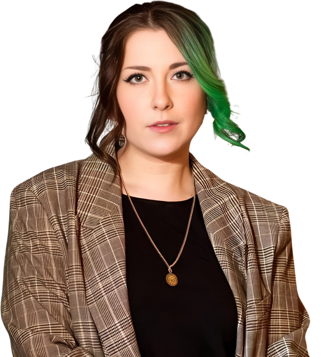
Lead with real team and client faces. Never stock, never illustration, never an AI-generated face.
Photography that works


How a cutout sits in its frame
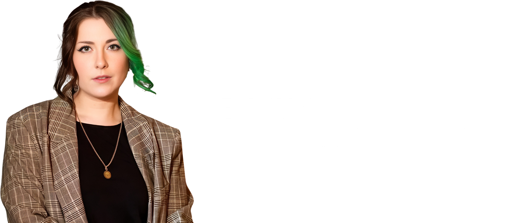
A cutout always stands on the bottom edge of its frame. Anchor it to the bottom, let it bleed off if it needs to, and never center it vertically: a torso floating in the middle of a panel reads as a severed body, not a person. Feet, hips or the bottom of the jacket meet the frame edge. Same rule on slides, in proposals, in ads and in AI-generated banners.
Cutouts with type baked in
Several team cutouts ship with a white name plate already on the file. On a Mint Soft field that type disappears, which is the single most common photo mistake in our decks. Those files go on SeedPine, or the plate gets removed and the name is set in Lato beside the photo, which is the treatment we prefer. Never letterbox a wide plate file into a card-shaped frame: half the panel ends up empty. Check every cutout against its ground and its frame before it ships.
Photography to avoid
No unnatural filters and never a shifted skin tone. No distortion: never stretch or warp a photo to fit a frame. No headline on a busy area without a scrim. If a photo needs a heavy filter, a stretch, or a headline dropped on a busy area, it is the wrong photo or the wrong treatment.
Brand-true creative, made with AI.
Generative tools follow the prompt and default to whatever the internet does. These four rules keep AI output inside the system.
Attach, never describe
Models cannot draw the wordmark or the growth-bar leaf. Every attempt invents a generic leaf. Attach logo-primary.png and leaf-green.png as reference files and tell the model to place them exactly as supplied.
Keep the field light
Mint Soft or Paper across the whole frame. Never a dark canvas, and never a layout split into a light half and a dark half. Contrast comes from one colored band.
Leaf once loud, then quiet
One leaf at 7 to 14% bleeding off a corner, then three or four more at 4 to 5% scattered as faint texture. Never behind headlines, buttons or a person.
Write a brief, not a spec
One flowing paragraph beats a sectioned spec sheet. Name every color by hex, put the copy in quotes verbatim, and say plainly what the model must not invent.
The house prompt
The starting point for any BusySeed banner, ad or thumbnail. Paste it whole and replace the bracketed parts.
Clean flat vector marketing banner for a B2B SaaS [ASSET], wide 3:2, generous negative space, premium and confident. Soft mint-green background (#EEF4EB), left-aligned text block. Use attached image 1 as the BusySeed logo, placed small in the top-left corner exactly as supplied. Use attached image 2 as a large leaf watermark at 10% opacity bleeding off the top-right corner, then reuse that same leaf 4 more times at 4 to 5% as faint scattered texture, never behind text or a person. Do not draw, redraw or invent any logo or leaf yourself. Small orange pill reading "[EYEBROW]" in white, beside "[DETAIL]" in forest-green caps. Bold serif headline in deep forest green (#08441E) reading "[HEADLINE]", final word in warm orange (#F98D13). Gray sans-serif subheadline: "[SUBHEAD]". Three green circular check-marks: "[POINT 1]", "[POINT 2]", "[POINT 3]". Orange rounded "[CTA]" button with small gray text beside it: "[ATTRIBUTION]". On the right, [SUBJECT]. Palette: #08441E, #5D9247, #F98D13, #EEF4EB, off-white. Modern, human, corporate, editorial.
Always attach
1. The logo PNG. 2. The leaf PNG. 3. A cut-out portrait if a person appears. 4. Any partner badge you name.
Never let it
Draw the logo, the leaf or a partner badge. Fill the canvas with black. Put a headline on orange. Generate a human face.
If it comes out wrong
A wrong leaf means it was described, not attached. Too dark means the background line was ignored.
AI features inside our products
| Rule | What it means in the UI |
|---|---|
| Always marked | An ✨ glyph and the word "AI" on anything a model produced. No silent generation. |
| Always reversible | Dismiss, edit, or undo, present at the point of output. |
| Never auto-writes | A model can draft and can flag. A human confirms before anything is saved or sent. |
| Confidence in words | "Low confidence, worth a check", not "0.62". Operators do not read probabilities. |
| Sources named | Which records the observation came from, linked. |
Every claim has to be one we can defend.
| 500+ | businesses served |
| $540M+ | in client revenue generated |
| 5.0 | on Clutch, and 100+ five-star reviews |
| Top 10 | US agency, and #1 Growth Group by TrustAnalytica |
| Certified | Google Partner, Meta Partner, HubSpot Solutions Partner |
No age or anniversary claims
The 10-year badge is retired and longevity is not a headline. In AI and GEO especially, age reads as legacy rather than authority. Lead with accreditation and scale.
The proof chip
A white rounded card with a soft shadow, a green icon on the left, the number in bold SeedPine and a small gray label beneath. Stack at most two.
Never claim
Any award, council or membership we cannot evidence on request.
Every line carries a number.
A deliverable without a quantity is not a deliverable. If a line item has no number on it, it does not go on the proposal.
No
- Organic social posting across Facebook, Instagram and LinkedIn
- Custom content creation
- Multi-step email cadences
Yes
- 12 organic social posts per month across Facebook, Instagram and LinkedIn
- 8 custom branded graphics per month
- 5-touch email cadence to 2,000 contacts per month
Template anatomy
The Authority Foundation / Prosal layout is the standard, and every proposal follows it. Left panel, SeedTeal ground: icon, package name, price pill, italic tagline, and an EXPECTED OUTPUT box. Right side: a What's Included header, green check-circle bullets, and one small italic footnote at the bottom. Pricing holds at the standard entry point with a six month minimum.
Quantities apply to posts, graphics, ad creatives, contacts reached, emails sent, calls made, hours, reports, audiences and tests.
Nine checks.
- 1The tier is named in the ticket, and the chrome was copied, not designed.
- 2Every table is the hairline ledger, with sentence-case headers.
- 3No Georgia below 24px, anywhere.
- 4Uppercase appears only in eyebrows, status pills and micro-labels of two or three words.
- 5Orange appears at most once per view, and only in Tier C or on one key number.
- 6Loading, empty and error states exist for every list on the screen.
- 7Every animation is on the one curve, under 400ms, and dies under reduced motion.
- 8No internal ids, run states or model names on a Tier C screen.
- 9Someone who uses another BusySeed product can find the primary action in under five seconds.